Going Rogue: Color Theory and the Perks of the Unexpected
One of the first things a couple decides when designing their wedding is the color palette. From there, they can choose decor, flowers, bridesmaid dresses, and groomsmen suits. The colors make the event look consistent from invitations to menus to thank you cards. For something so important, it’s understandable to want to play it safe. White and green is a stunning, classic color scheme. It is bridal, timeless, and clean. But it’s not the only option out there. If you want to dive into color but aren’t sure where to start, let’s break out a color wheel and dig in.

I get it - it feels really bold to say you want the color red in your wedding when you have burgundy in mind. As a Nebraska native, red immediately makes me think of football games - not quite the same vibe as a wedding. However, burgundy is ultimately a dark red. Even if the word “red” is scary, you already have it in your event. It’s not adding something new, but rather expanding on the idea you already have. Blending all shades of red from bright, saturated rubies to deep, moody burgundies that lean toward black will instantly look rich and elevated. Colors are going to look richer, fuller, and more dynamic if you use multiple shades of the same hue.
Both of these shoots look like they’re utilizing shades of the same color, but they each have a little help from their neighbors on the color wheel (analogous colors). The left uses both violet and red, and the right has hints of peach and brown, creating the illusion of darker yellow.


Photo credits: Rebecca Onnen, Britany Moser
If you’re using a variety of colors and you feel like something is missing, it could be helpful to pull out a color wheel and start drawing lines. Think back to your intro to art classes in school. Colors directly across the wheel from each other (complimentary) are going to make sense together. Blue and white weddings are trending and oh so pretty, but you can add an extra element by bringing in orange or its softer counterparts - peach and tan. Or, if you want the playful trend of lavender and orange, you may want to add some light greenery to create an equal triangle on the wheel, or triadic color palette.
One of the reasons wicker works so well with blue and white weddings is that brown is essentially orange without being intrusive. It keeps blue and white as the focus but adds something cohesive. Peach feels more like adding a new color, but it’s a color that looks so right.

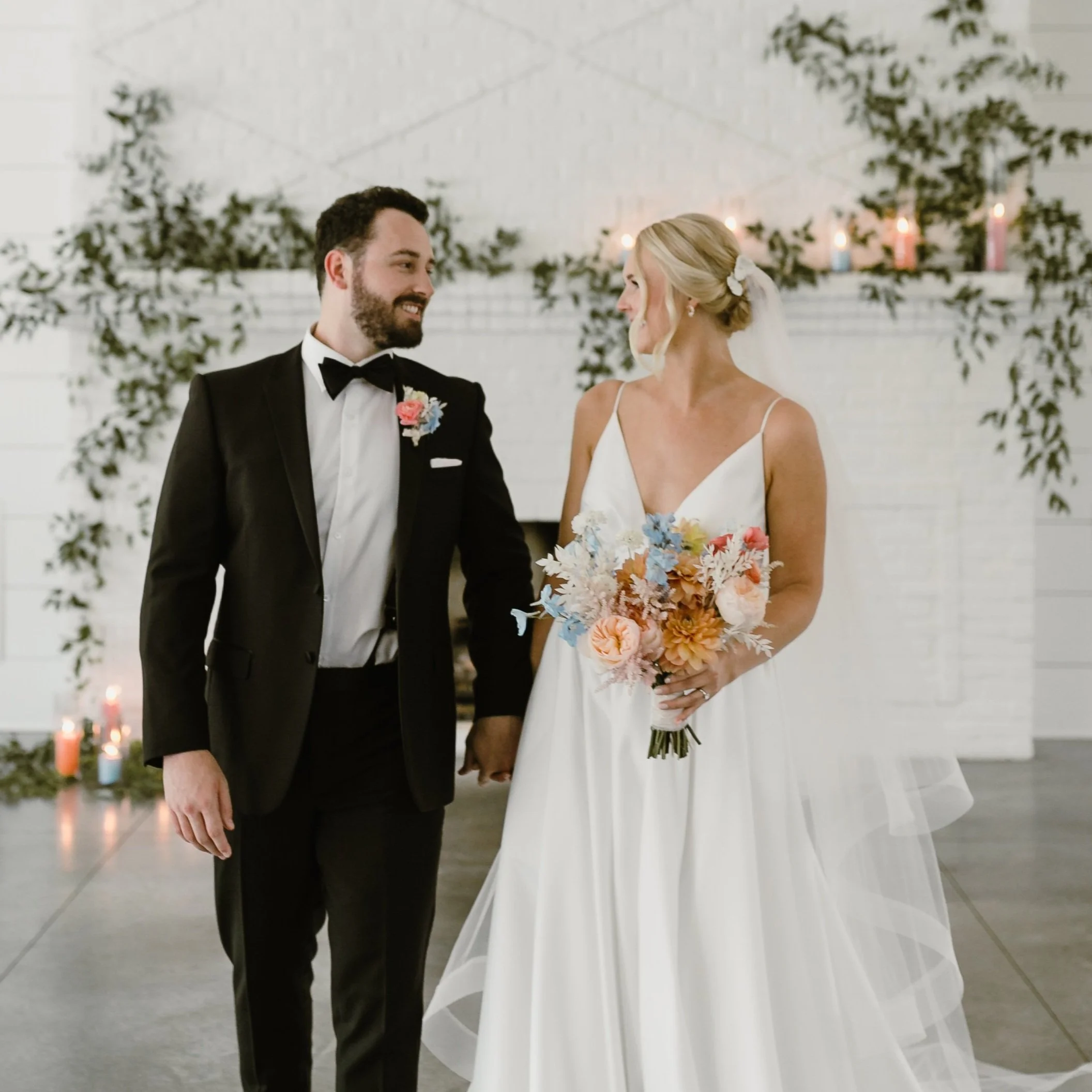
Photo credits: Kenzie Banks, Halfacre House
It doesn’t take much of an unexpected color to add a unique element to your design. Another strategy from color theory is to use 60-30-10 proportions. That means let your main color take up 60% of your design, your secondary color takes 30%, and an accent color for the final 10%. This formula lets you focus on one color and use the others to highlight it and your overall design.
These spring florals have a whole lot more than three colors, but the unexpected 10% color is gray/black. The stands are a true black, but if you look closely you can see textured gray foliage in the arrangements. These colors offset the bright florals and help them to look lighter and less green. Of course, the sweet pups help to tie it all together.

Leaning into color theory can instantly elevate your event and make it feel more unique. As you choose linens, invitations, dresses, and flowers, keep in mind the extra flair you’re looking for might be hiding across the color wheel. If you’re really struggling to nail down a palette, I would even recommend buying a color wheel online - you can get one for a couple dollars - to have something physical to look at as you decide. Don’t be afraid to play around and have fun with it! You may find the smallest change can take your design to a whole new level.
xoxo, Rebecca